
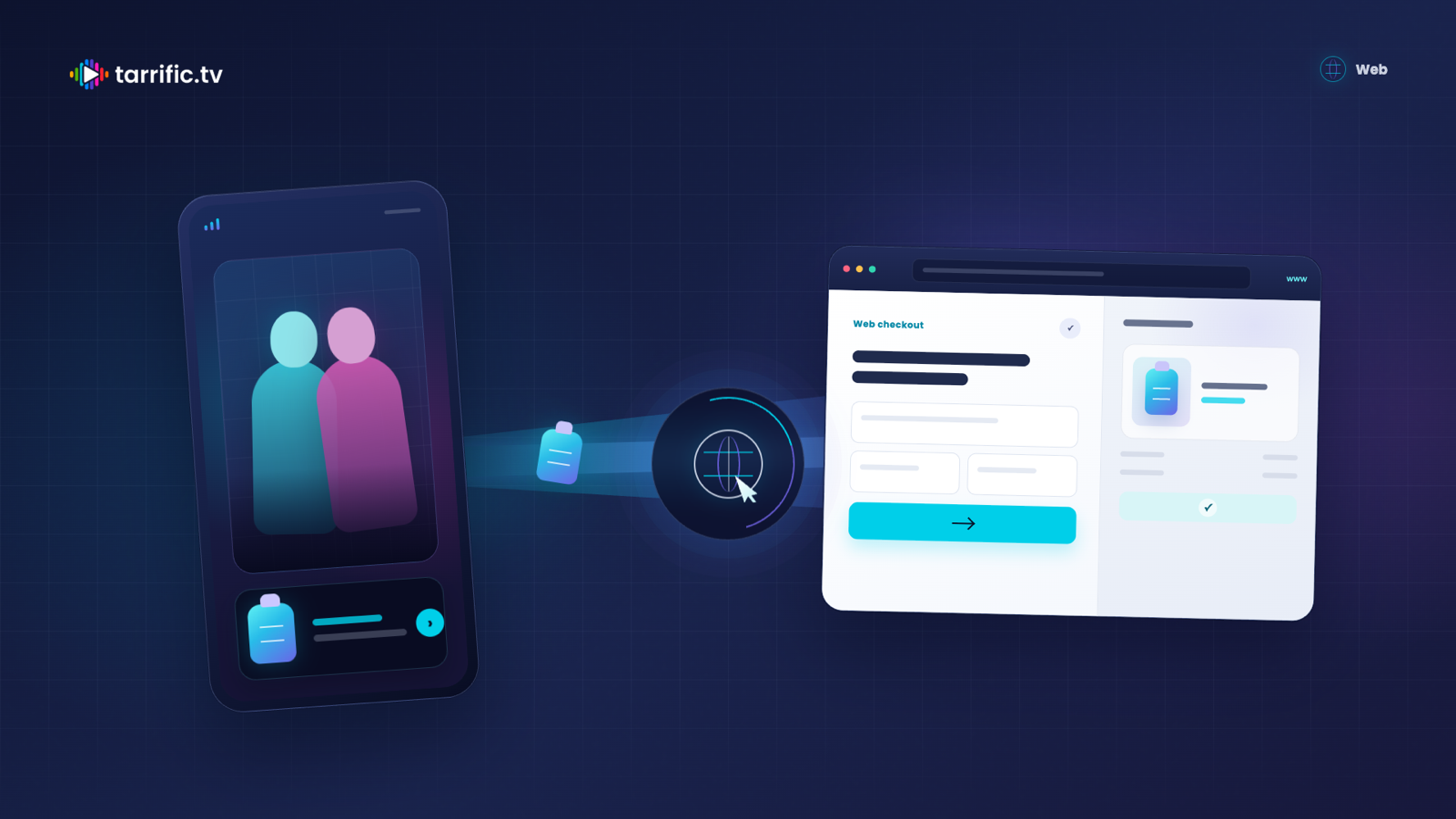
A short-drama viewer can move from an episode directly to a product page and check out in the same mobile session. No app install is required. That makes this inventory useful to e-commerce brands that sell on their own websites, whether they have no app or prefer not to use one as the path to purchase.
The landing page carries much of the conversion job. The click begins inside an entertainment experience, not with a shopper comparing products. Your page must preserve the promise of the ad, explain the product immediately, and make the next action easy. Its job is to help an interested viewer make one clear decision.
Why the landing page beats the store listing
An app store listing adds a separate commitment between interest and purchase. The viewer must evaluate an app, install it, open it, and find the offer again. Each step gives the original reason for clicking time to fade.
A dedicated mobile landing page keeps that reason visible. It can open on the exact product shown in the creative, with the offer already applied and a direct route to checkout.
Do not send a specific product ad to a homepage, collection page, or search results page. Send it to that product. At the first click, too much choice becomes work.
The three-second handoff
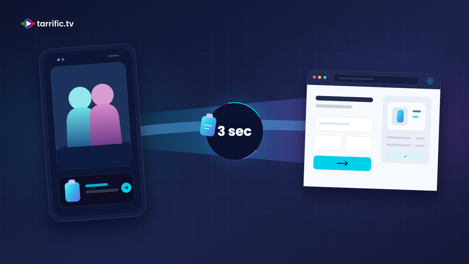
In the first three seconds, the visitor should recognize that the page is the intended destination. Show the same product, the same offer, and the same main color or visual treatment used in the ad. This continuity answers one question immediately: “Am I in the right place?”
The headline should state the value in plain language. The price and offer should be visible without scrolling. The main image should match the creative. If the ad shows a red version, do not open on a blue one. If it promises 20 percent off, do not make the shopper hunt for a code.
This is a handoff, not a second pitch. Avoid a different product angle, a new promotion, or a dense brand story at the top. Confirm the click first. Add detail after the visitor understands what is being sold and what to do next.
What the page needs
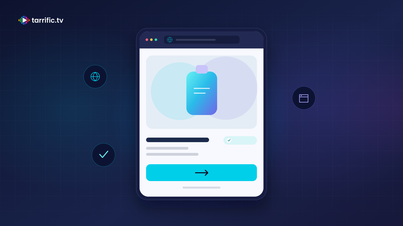
Design for a phone held vertically. Above the fold, show one product, one clear benefit, the final price, and one primary button. The first screen should not look like a catalog.
Use a specific label such as “Buy now” or “Get the offer.” Keep secondary links quiet. Navigation, pop-ups, account prompts, and competing promotions distract from the action the ad created.
Allow guest checkout. This visitor may know the product but not the store. Apply the advertised offer automatically, and show that it has been applied. A missing discount or unexplained price change breaks trust quickly.
Keep the initial page simple, fast, and usable on a mobile connection. Make the product image and purchase button available quickly. Below the first screen, answer the questions that block purchase: what the product does, what is included, delivery timing, returns, and credible proof.
Match the moment
Short-drama viewing creates useful hypotheses about context. An evening episode break may find someone relaxing, holding a phone in one hand, and open to a product that fits the story mood or an immediate need. Romance or family-drama audiences may skew female and mobile-first. These are starting points, not facts about every viewer.
Use context to shape a first test. A convenience product might emphasize an easier evening routine. A beauty or fashion offer might fit the tone of a romance title. A household product might connect naturally with a family-drama setting.
Then test what changes purchase behavior. Compare offers, product angles, and page variants within relevant genres, languages, and episode moments. Let results refine the hypothesis. Do not turn genre into a stereotype or assume audience patterns determine what every individual wants.
What to bid to
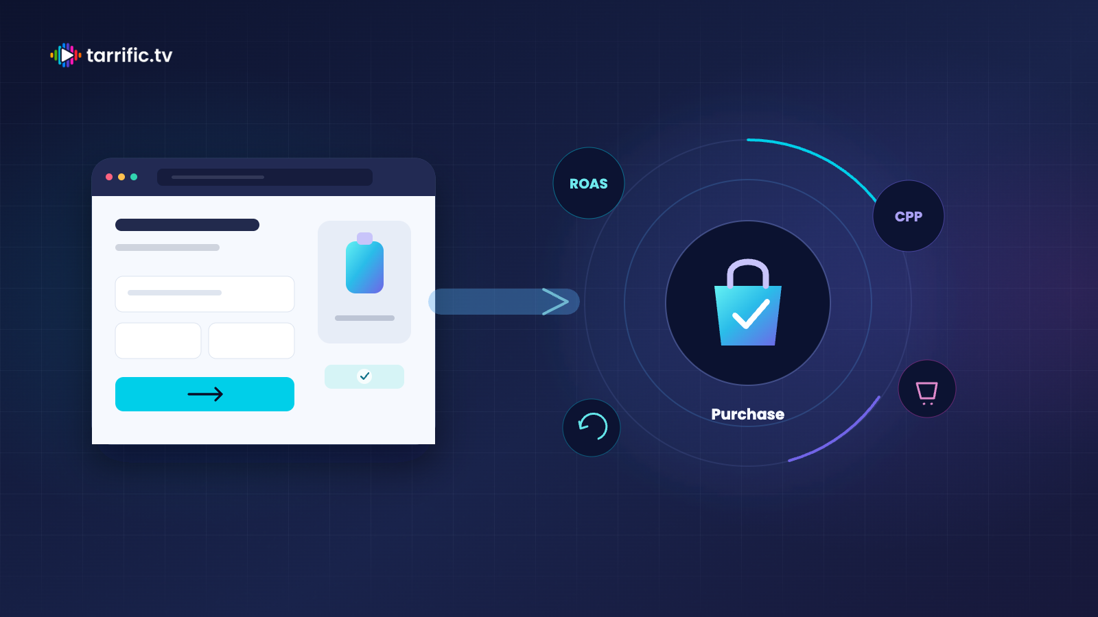
Use purchase as the primary optimization event. Set a return on ad spend target when order values vary, or a cost-per-purchase target when first-order economics are consistent. The bid goal should reflect the business result you need.
Use add-to-cart as an early signal while purchase volume develops. It can show whether the creative and page create intent, but it should not replace purchase as the decision metric. Many carts can still end in weak sales because of shipping, trust, or checkout friction.
Track repeat purchase as a guardrail. A low first-order cost can mislead if those customers rarely return or depend on discounts that weaken long-term value.
Treat checkout conversion rate as the page health metric. If clicks and carts are healthy but purchases fall behind, inspect the offer, delivery terms, payment options, and mobile usability before blaming the inventory.
Launch checklist
The ad and page show the same product, offer, and main color.
One product and one primary purchase button appear above the fold.
The page works in a mobile portrait layout and loads quickly.
The offer is applied automatically and stays visible at checkout.
Guest checkout is available without an account requirement.
Purchase is primary, add-to-cart is an early signal, repeat purchase is a guardrail, and checkout conversion rate measures page health.